


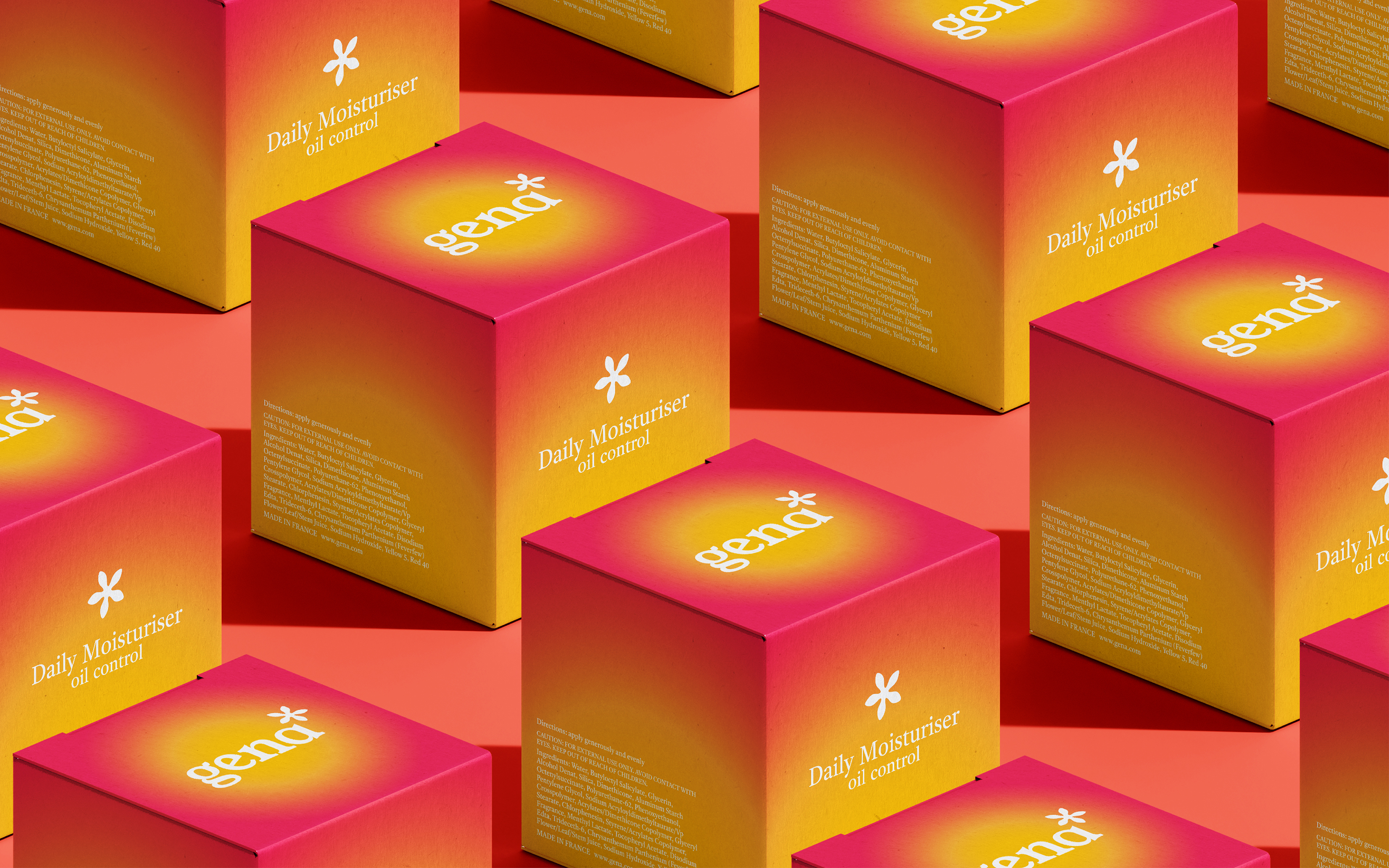

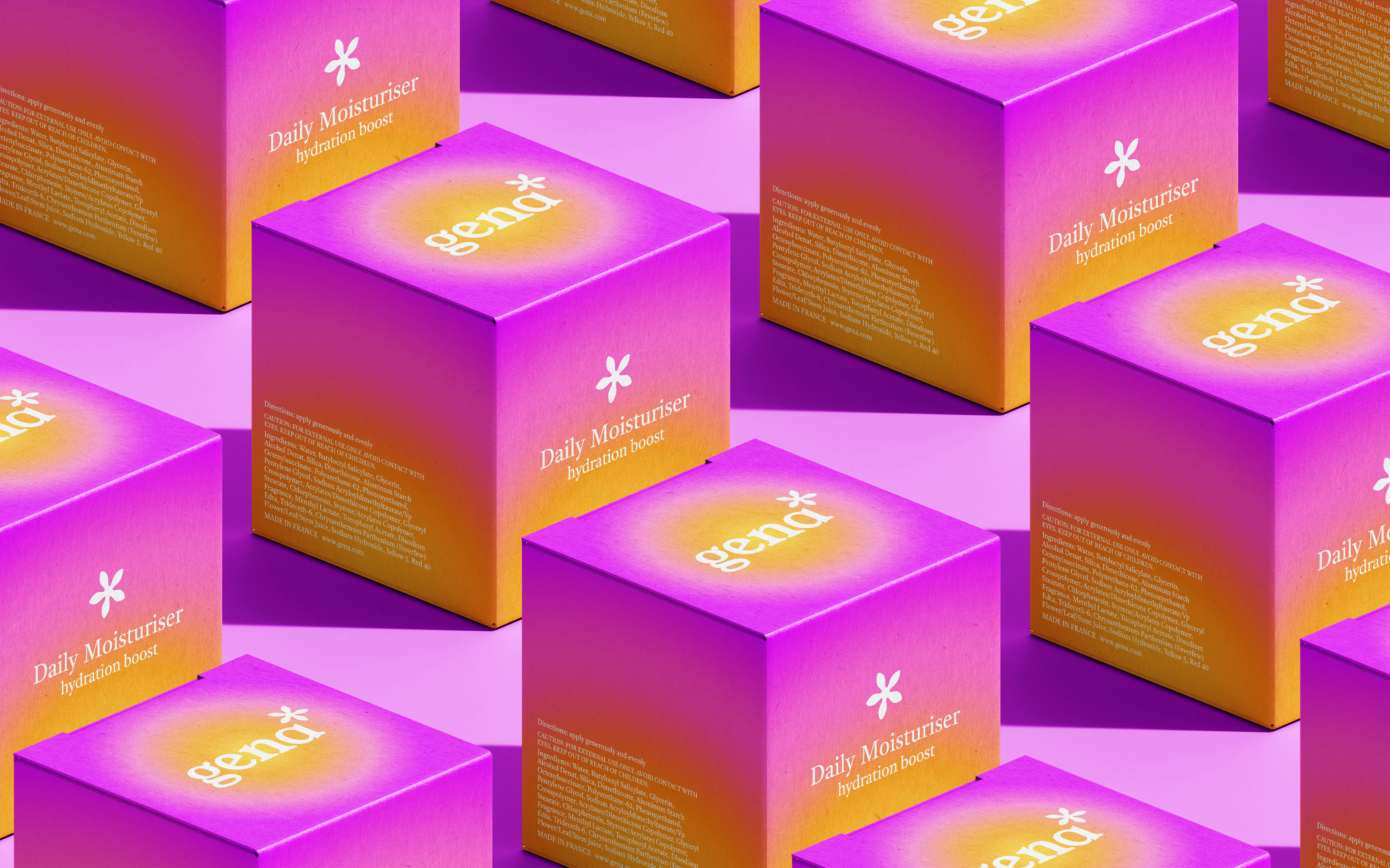
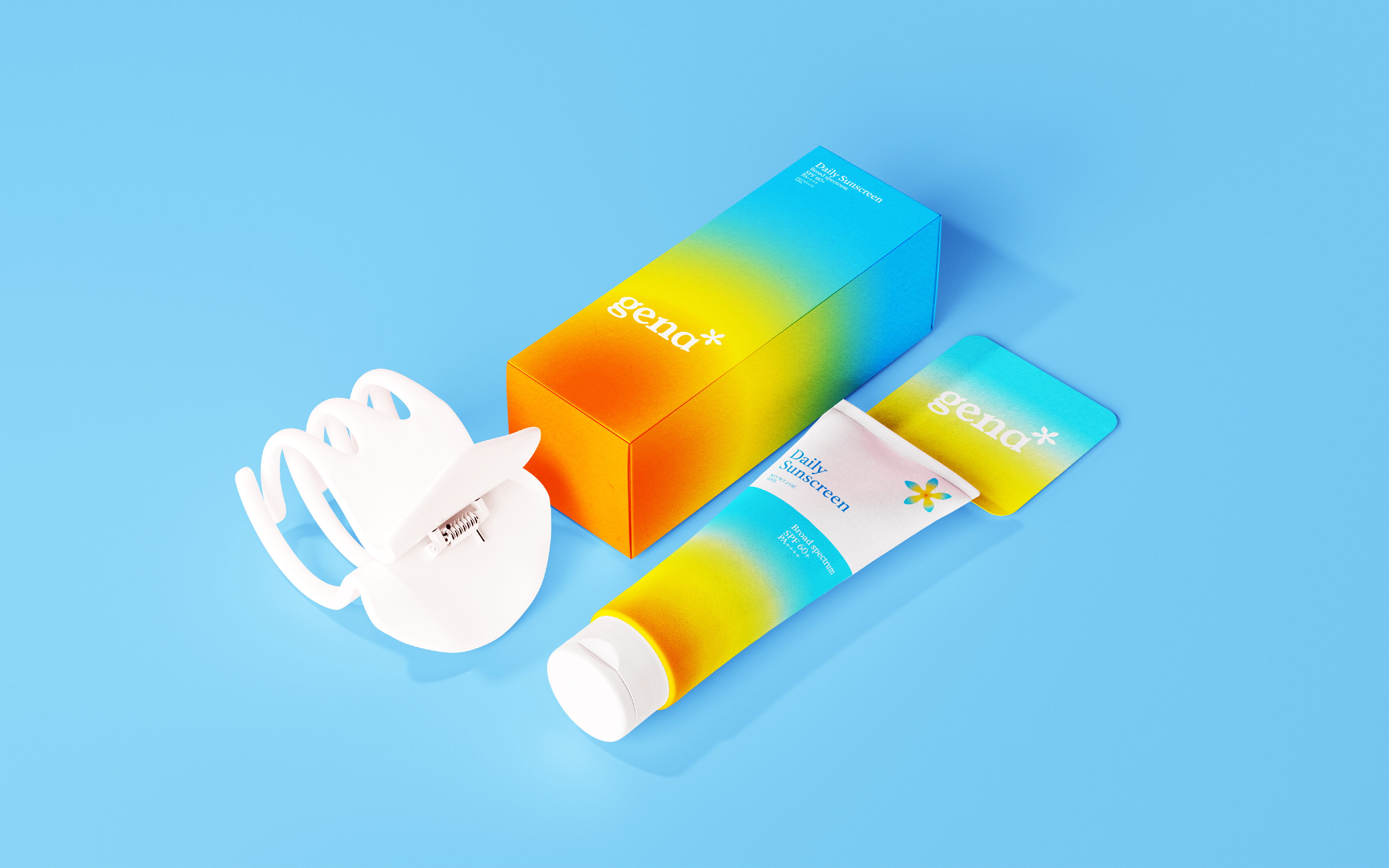
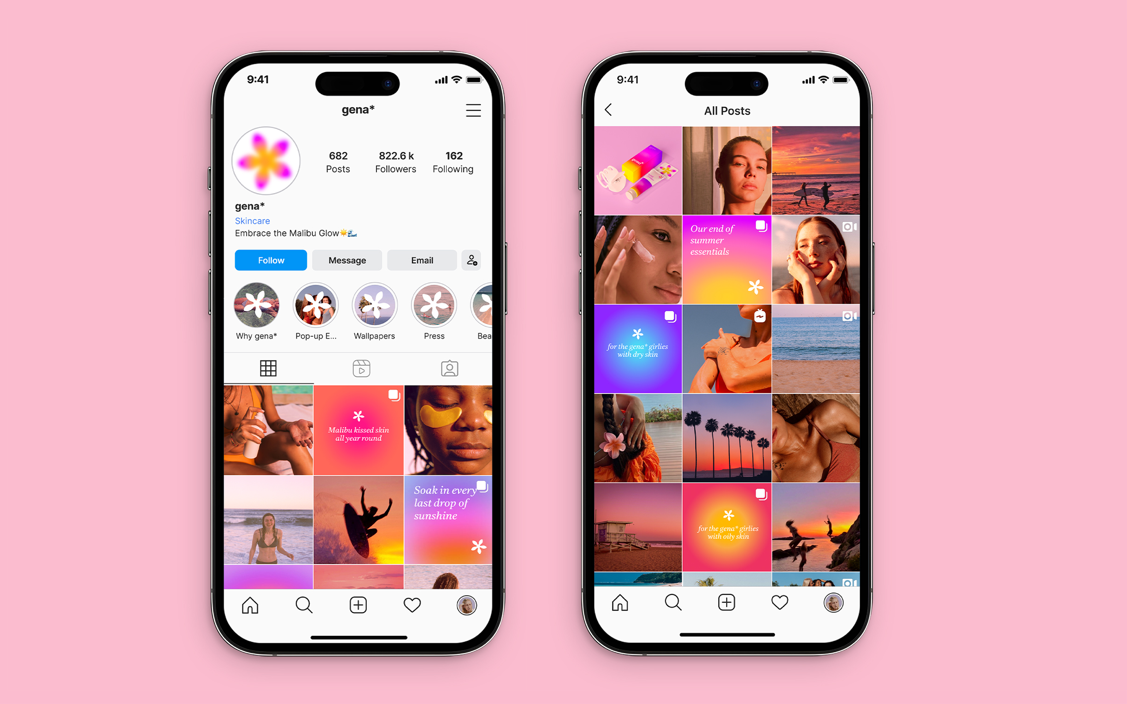


Rebranding the skincare brand Neutrogena to appeal to a younger demographic. The current branding for Neutrogena focuses on highlighting its dermatologist recommended products with a clinical tone and atmosphere. This rebrand aims at moving the focus away from anti-ageing, and instead focusing on attracting Gen-Z consumers that are interested in skincare as a leisurely part of one’s daily routine. Leaning into Neutrogena’s Californian roots, the use of warm vibrant colours and gradients aims to evoke dreamy Malibu sunsets and themes surrounding summer. This encourages a lifestyle of stepping out and embracing the sunshine, rather than trying to avoid it. Changing the name to “gena*” acts as a catchy nickname for the original brand name, making it appeal to a younger audience. The asterisks are meant to emphasise on the validation of the name change, similar to that of a correction when texting, which relates to the demographic as well as creating a memorable symbol for the brand.